Elements
Elements of the editing canvas include the toolbar at the top, a status bar along the bottom, and the actual design surface with horizontal and vertical rulers. The white, rectangular portion of the design surface represents your dashboard and is generally referred to as the canvas. You design dashboards and other views simply by dragging items from the Explore window on the right, and placing them on the canvas. For example, drag a metric set to the canvas and it will automatically appear as a chart or other type of visualization showing actual data values. Or, add a label component to the canvas and use the Properties popup or window to change its font size and color.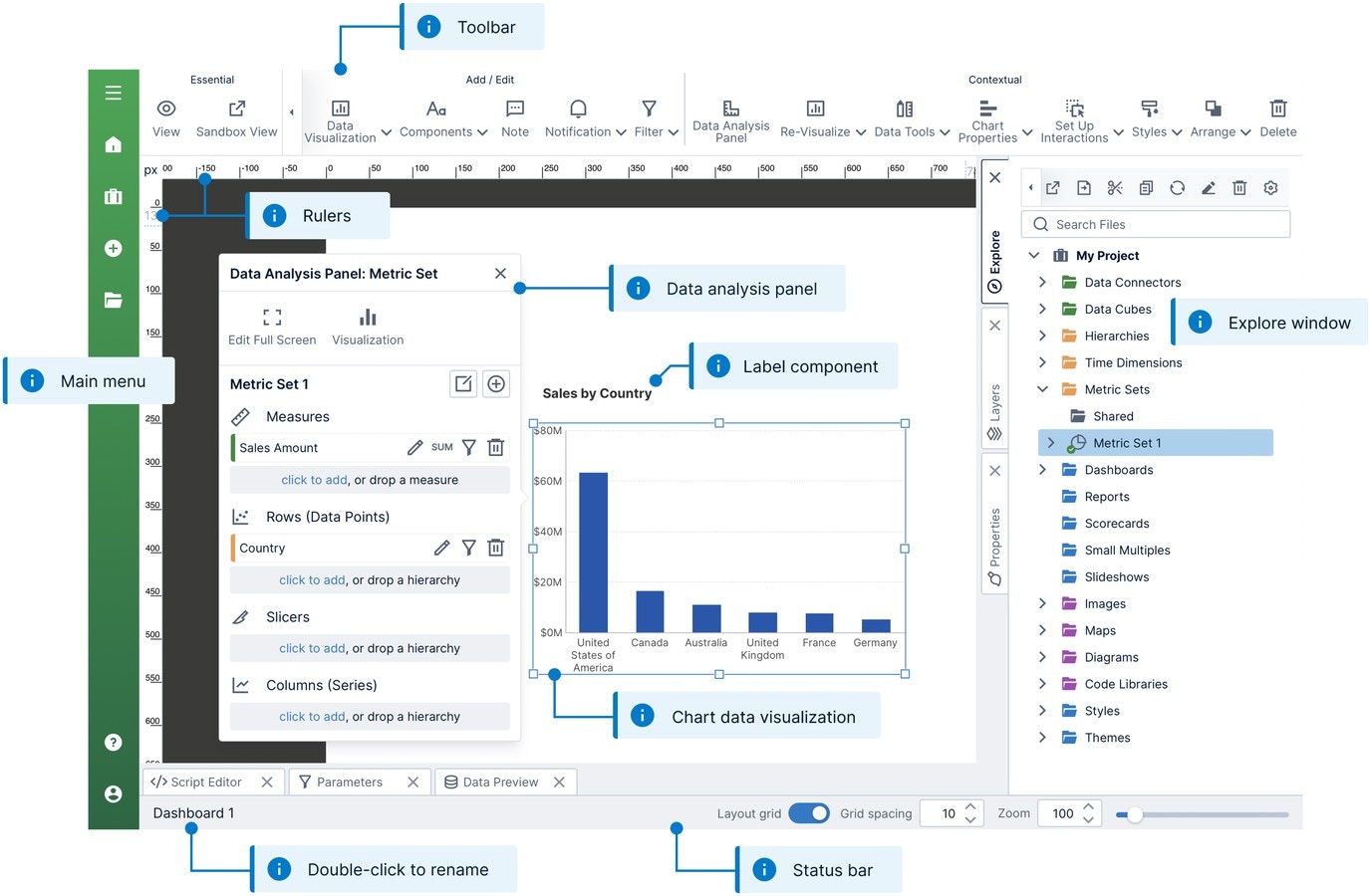
Toolbar
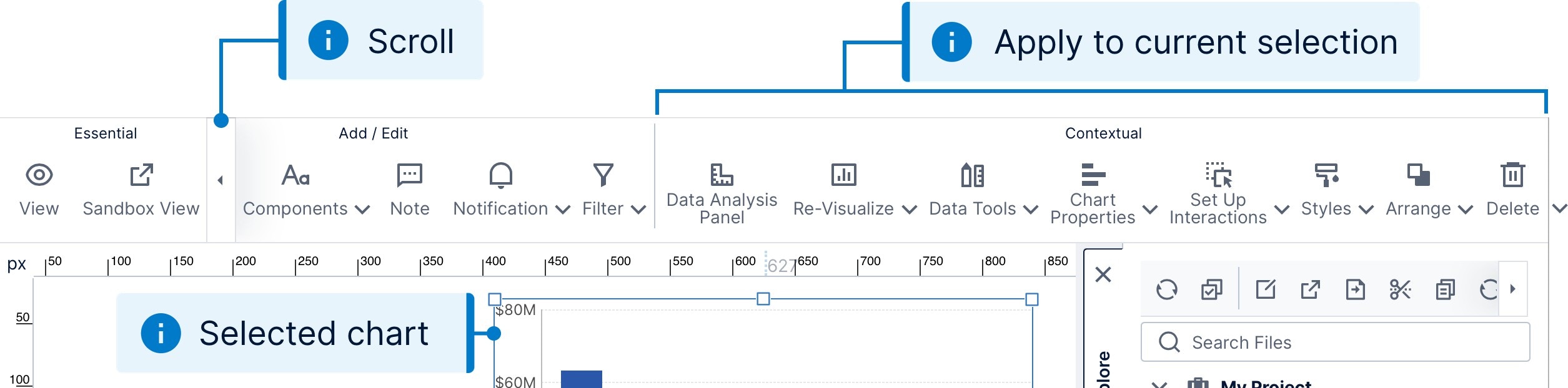
The toolbar at the top of the screen lets you perform a wide range of design functions. You can copy and paste items from the clipboard, add different types of content to the canvas, or apply a style or theme. Essential operations such as switching to view mode are always visible in the toolbar while the remaining buttons may be scrolled left or right depending on the available space.
Status Bar
The status bar (also known as a taskbar) displays the name of the current dashboard or view, and lets you rename it as well with a double-click. Hover over or long-tap the name to see its location, including its project and any subfolders. Next to the name is a message area that informs you whenever your editing has been auto-saved. Further to the right, you’ll find a set of controls for adjusting the zoom level and snap-to-grid options for the canvas.
Rulers
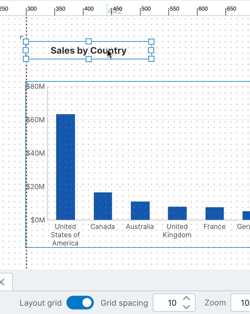
The horizontal and vertical rulers attached to the design surface help you to size and position items on the canvas. The default units are pixels (px), with the top-left corner of the canvas corresponding to the position 0,0. The rulers also track the location of your mouse pointer as you move it.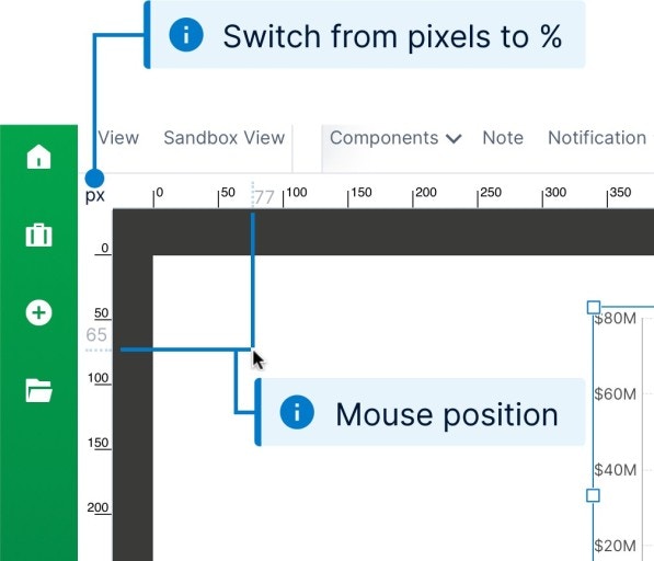
100%,100%.
Canvas
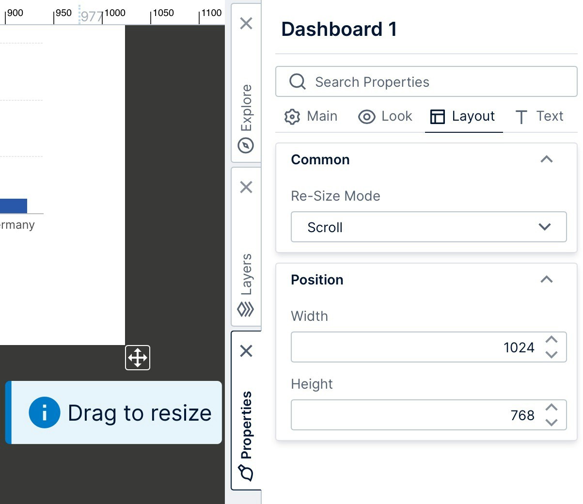
The canvas is the rectangular portion of the design surface that corresponds to the dashboard (or other view) that you are editing. When you click outside of any content, the toolbar presents options that are applicable to the view itself and the Properties window displays its properties such asRe-Size Mode and Height.
Windows
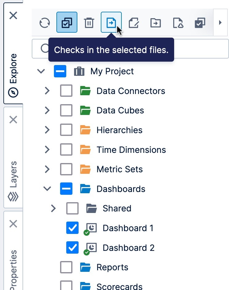
A set of tabbed windows are docked along the bottom and right sides of the screen that you can click to expand, collapse, or switch between. By default, the windows docked on the bottom are collapsed (e.g., the Parameters window), while the ones docked on the right are expanded (e.g., the Explore window). For details on how to work with and arrange these windows, see Using dockable windows.Explore
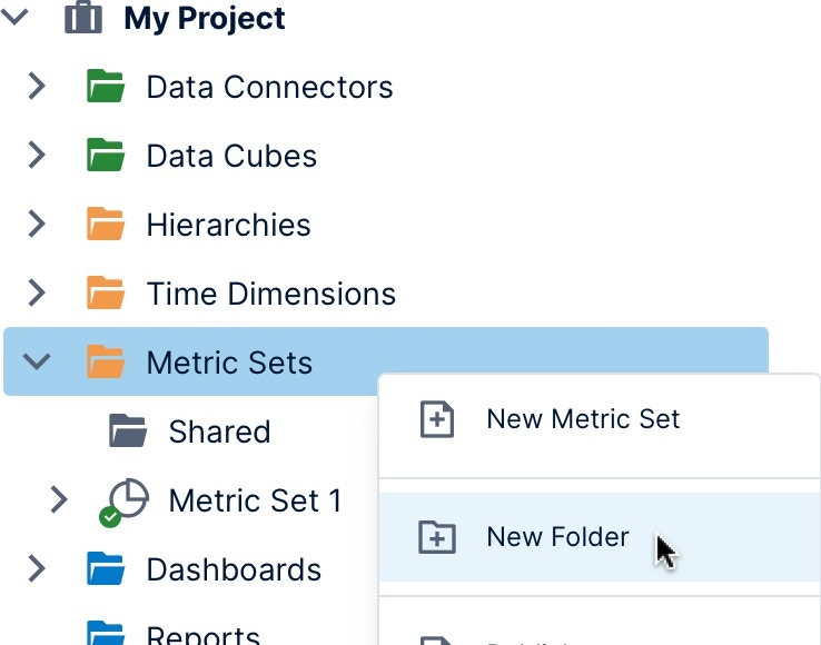
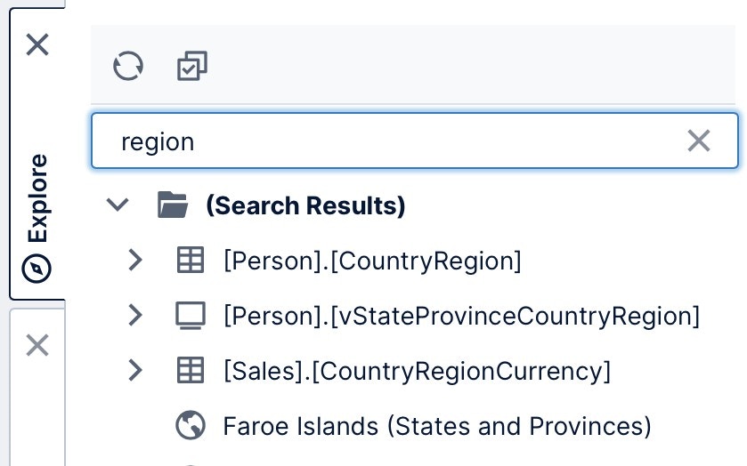
All of your work is done within the context of a current project, which allows users to collaborate together on the same dashboard or BI effort. The Explore window lets you navigate this project, which appears as a collection of folders containing files such as data connectors, metric sets, and dashboards, some of which can be expanded further. You can drag almost any of these items directly onto the canvas or on top of one content on it, including all types of data, metric sets, maps, themes, and even other dashboards or views. Expand another dashboard or other view to find its visualizations, which you can drag onto your canvas to reuse.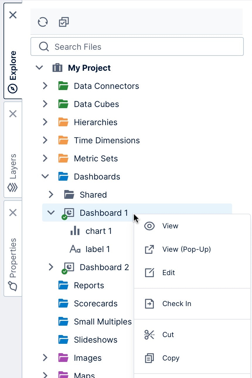
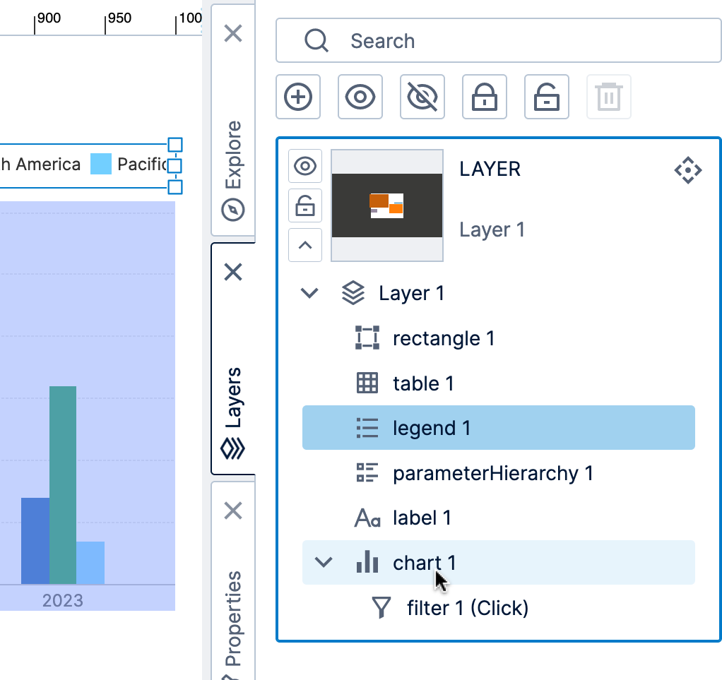
Layers
For power users and up,Layers give you a way to organize items on your canvas as a collective unit, which you can either show or hide while editing, or set up for viewers through interactions to show additional content. When editing a complex dashboard with overlapping content, you can hide or lock layers that you aren’t working on.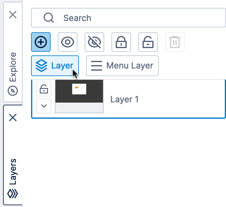
Properties
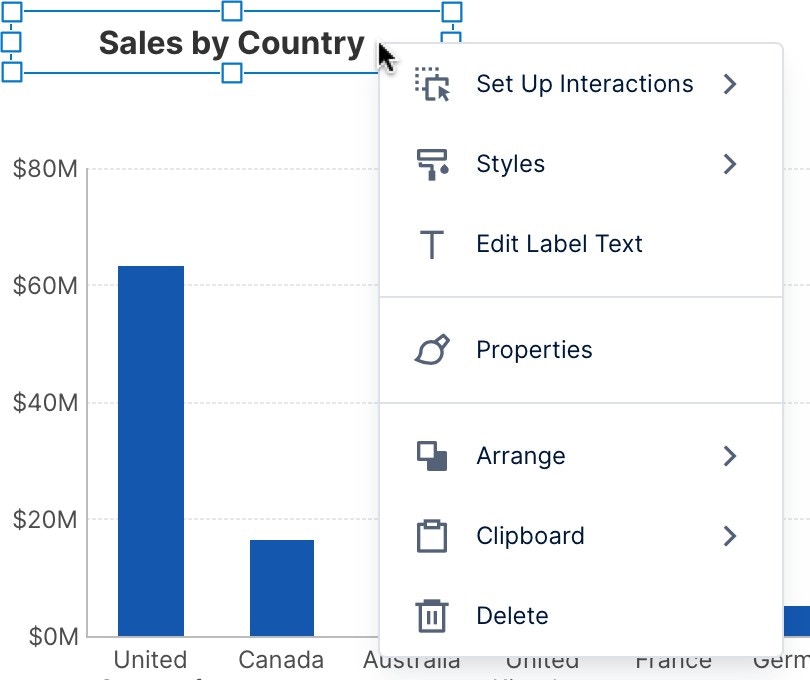
Properties are settings you can customize for visualizations, components, or parts of a view such as the dashboard’s canvas. Some of the most common properties can be accessed from the Quick Access Properties panel that appears when selecting an item on the canvas or clicking the canvas itself. All user types can access these properties when editing, which can include various font settings, fill color, and border/outline styling.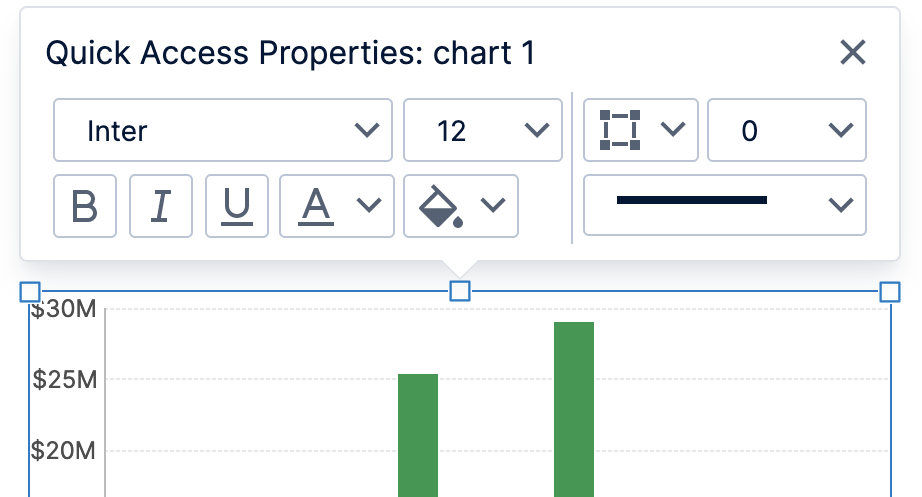
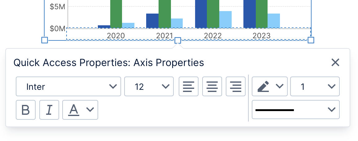
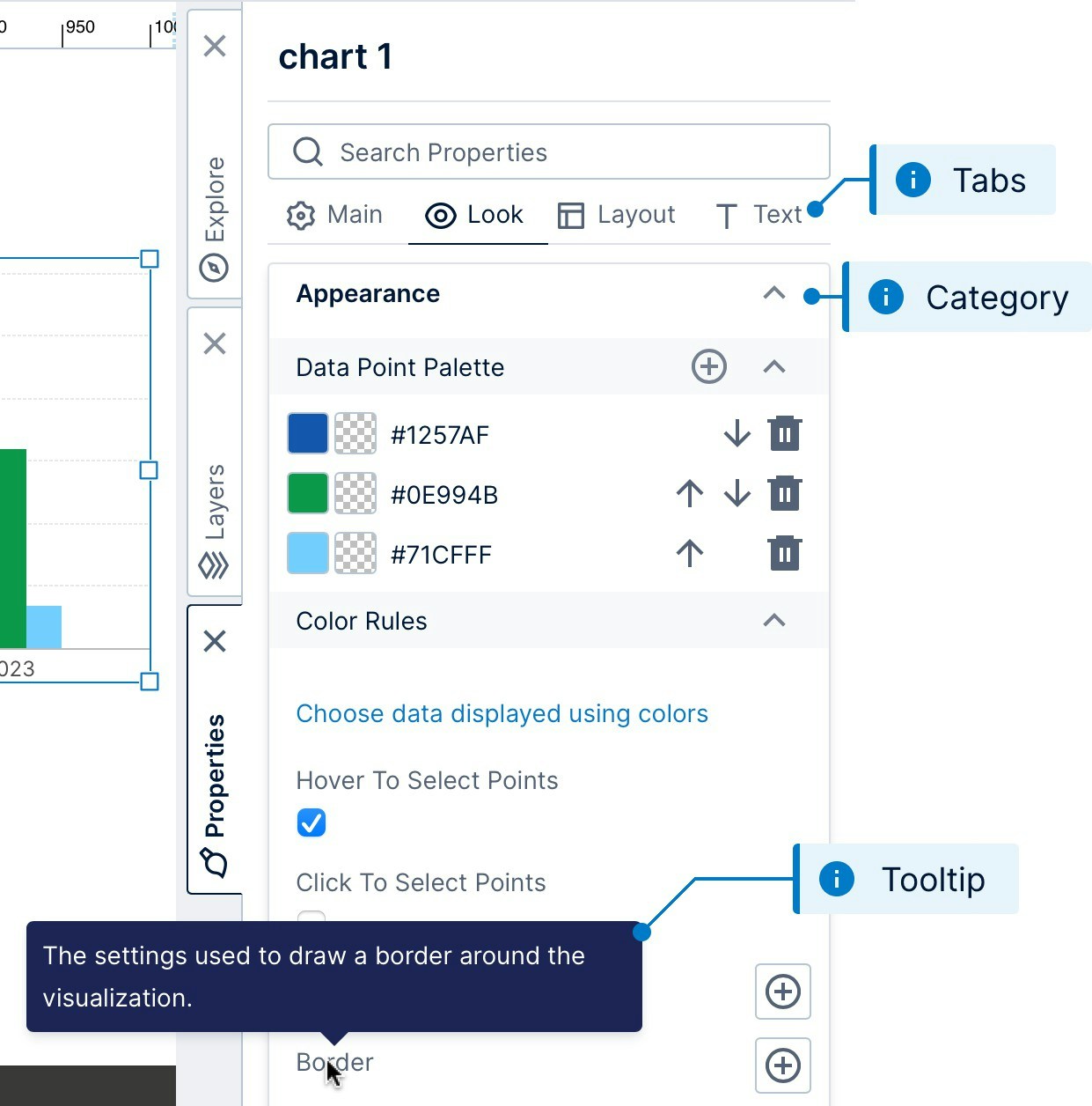
Note: Double-click or right-click a category to expand or collapse them all when navigating through many properties.
Script Editor
The script editor lets developer users write JavaScript code using the API to further customize and enhance views beyond the built-in interactions. Various script examples can be found in our script library. There are built-in pop-ups listing members and descriptions as you type that can you insert into your script, with direct links to the API reference. You can use code libraries to organize and reuse code between multiple scripts, dashboards, or other views.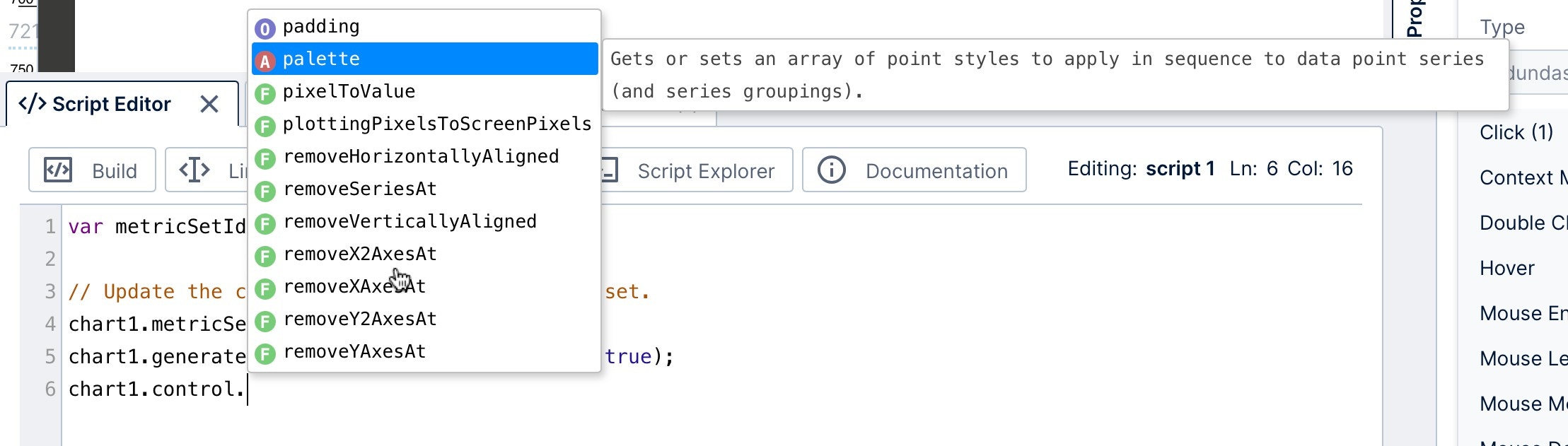
Parameters
View parameters pass selected values to data visualizations from a filter, interaction, or script. When you add a filter, a view parameter connects it to visualizations to pass them the selected filter values, or you can create one without a filter control. Open the Parameters window to view and manage the parameters of your dashboard, report, or other view.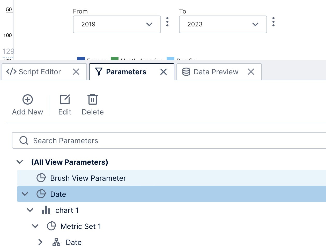
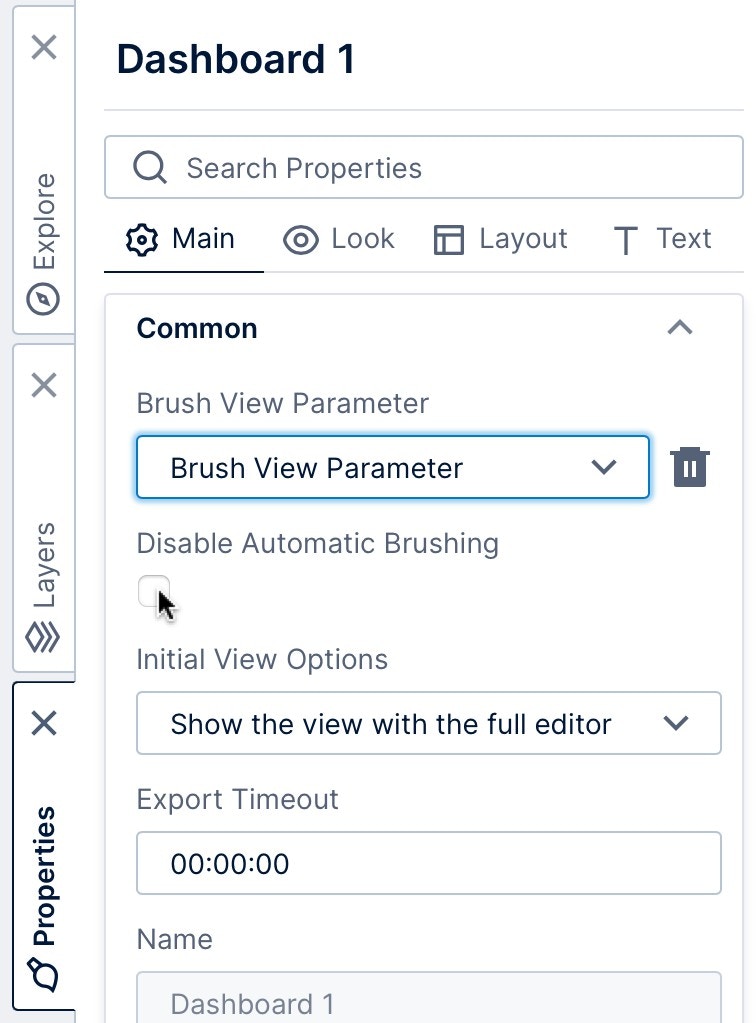
Note: For charts and tables that load additional data as you scroll or zoom, only the loaded data can be passed through parameters.
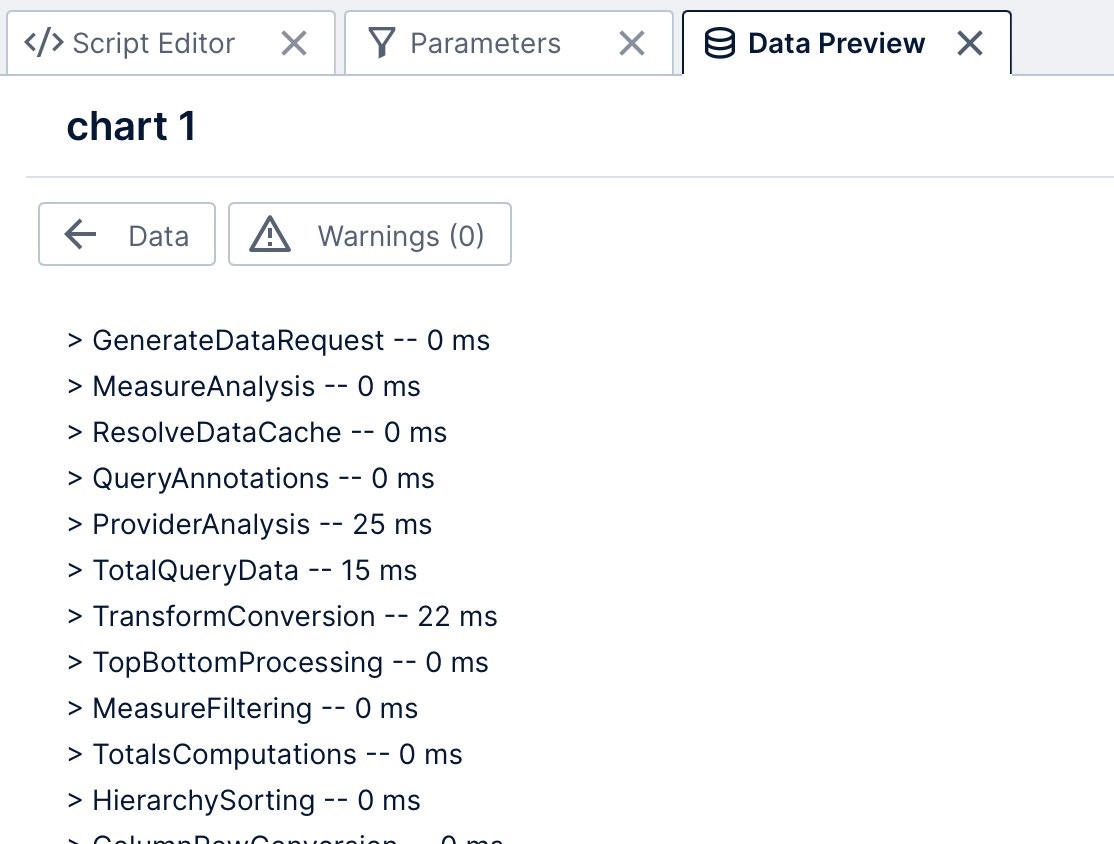
Data Preview
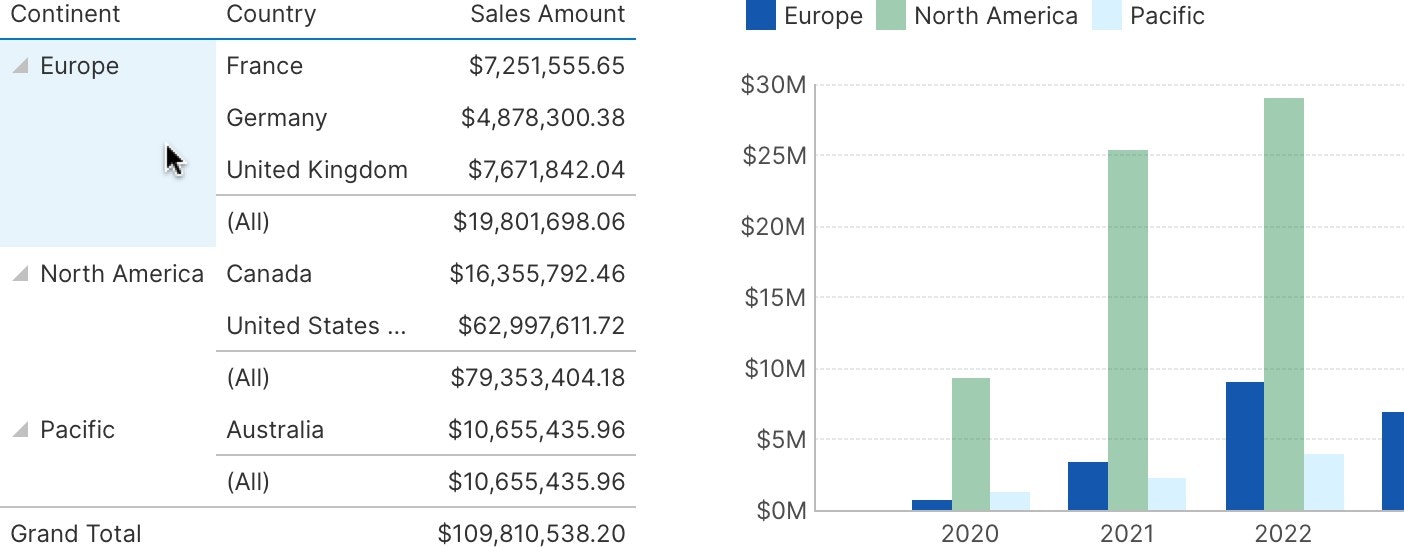
Select a data visualization on the canvas if you are editing a dashboard or view, and then open the Data Preview window to see the underlying data values displayed in a table. Note that the displayed preview may differ from the resulting data visualization, for example totals are normally hidden in charts. Hover over a table cell, or click to select a row or column in the Data Preview window, and corresponding data will be highlighted in your own visualizations. This is an example of the automatic data brushing.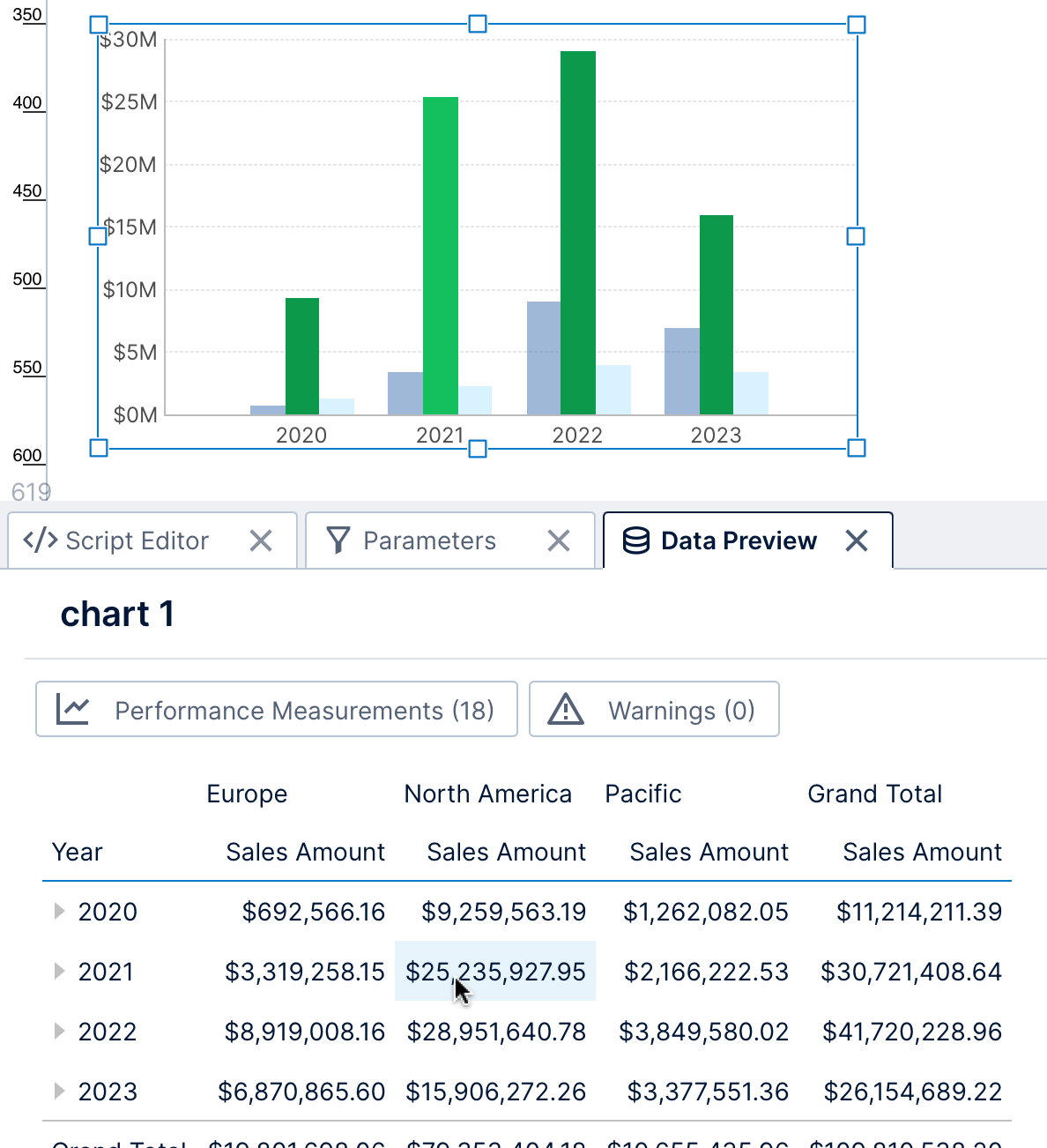
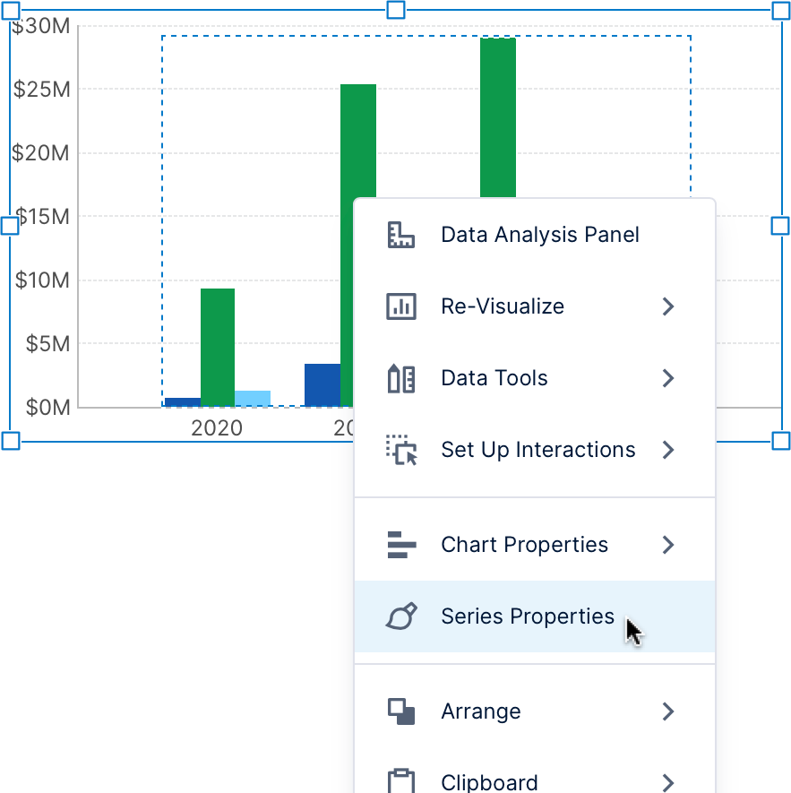
Data Analysis Panel
For every data visualization, there is a corresponding metric set that encapsulates the data itself, and visualization settings that assign data to parts of the data visualization. The Data Analysis Panel manages all these data-related settings, whereas the Properties window is used for visualization- specific settings for appearance, animation, interactivity, etc. If not yet open, click to a select a visualization and choose it from the toolbar or right-click/context menu.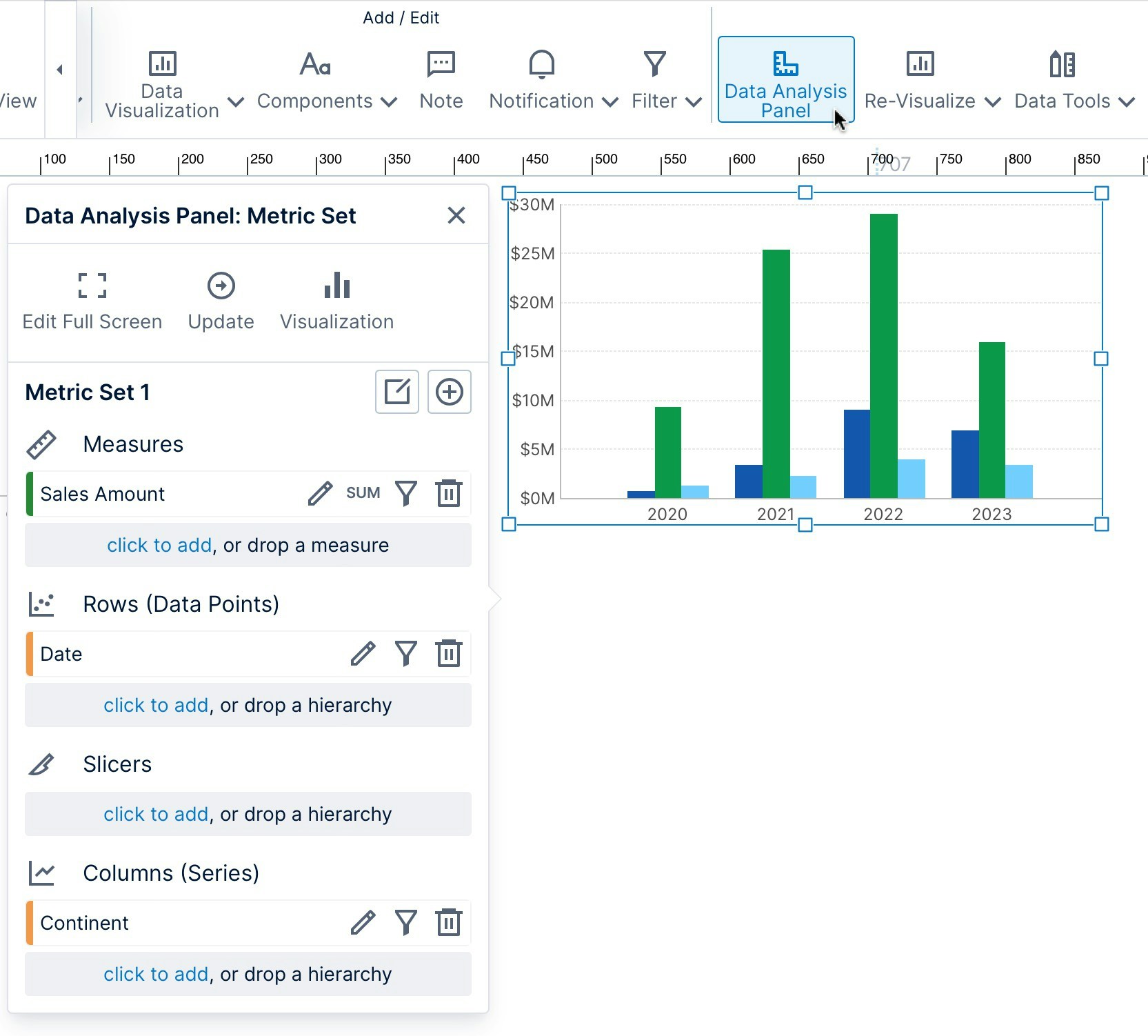
- Walkthrough: View Data With a Chart and Drill Down
- Symphony Metric Sets
- Setting Up the Visualization
- Slicers Versus Columns and Rows
- Using the HTML Label Component
- Accessibility
- Using Personalization
- Using Menu Layers
- Using Image Brushes
- Edit Versus View Mode and Sandbox View
- Using a Template Grid for Resizing
- Using Interactions
- Working With Projects
- List of Keyboard Shortcuts