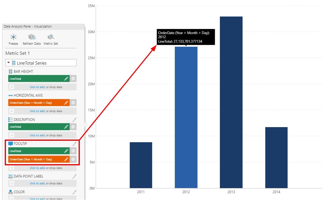
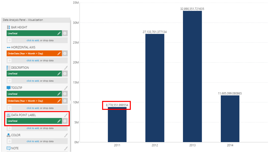
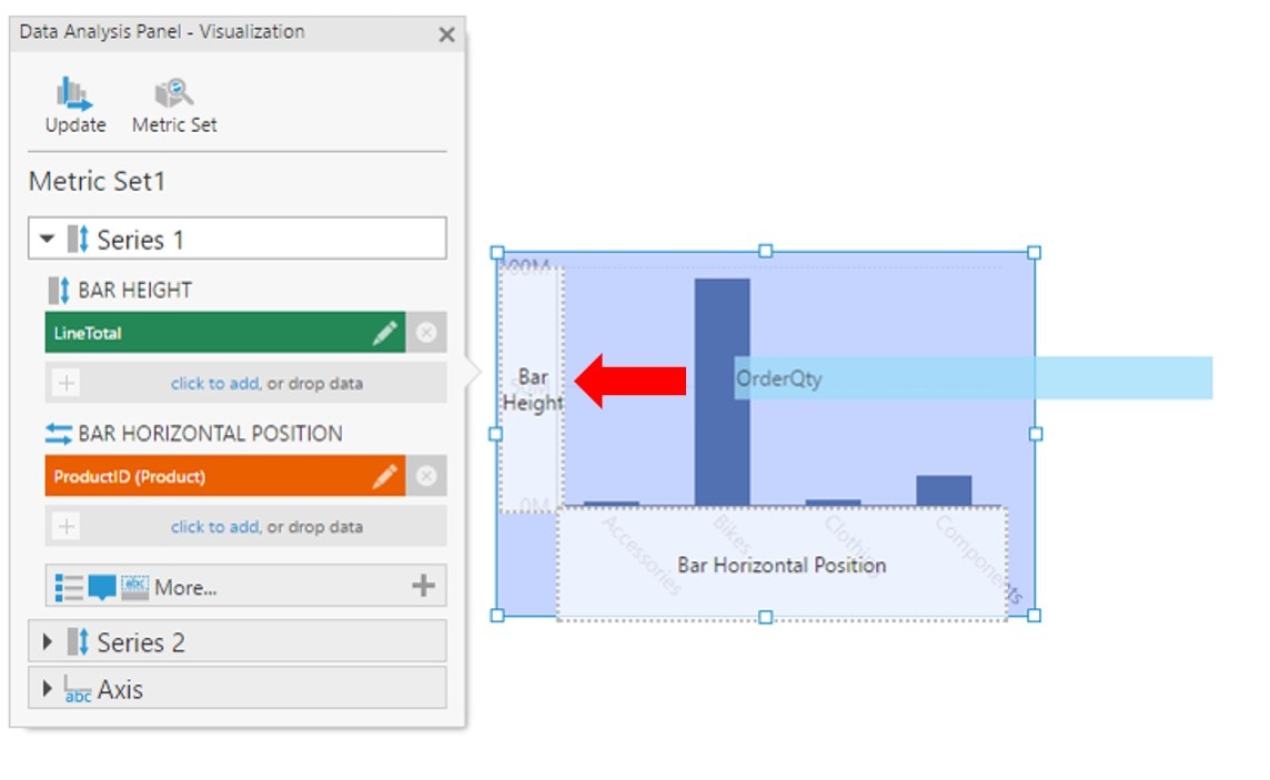
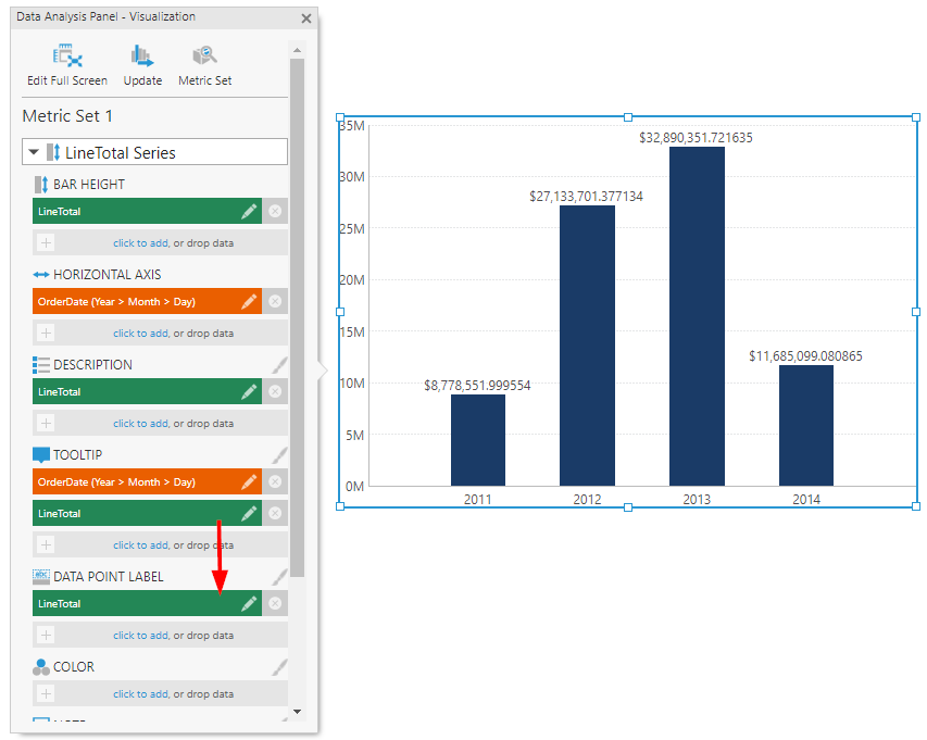
- Bar Height - lets you specify the measure that determines the height of each bar data point.
- Horizontal Axis - lets you specify what values determine the position of each bar data point along the x-axis.
- Description - lets you specify what measures or hierarchies should identify this series in the legend or a series label.
- Tooltip - lets you specify values to be displayed in a popup when the user hovers over or long-taps a data point.
- Data Point Label - lets you specify values to display in labels on or next to each data point.
- Color - lets you change the colors of data points based on the values you select.
- Note - lets you specify values to display as notes, the same way user-added notes or annotations are displayed.
- Series Grouping - lets you specify or remove hierarchies used to group this series into multiple series.
- Side-By-Side Position- lets you specify a hierarchy that determines which bar chart series or similar are overlaid or stacked together based on matching values.
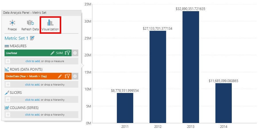
Metric Set Editor
Default Visualization
When you create a new metric set from the main menu, the visualization created there acts as a default visualization for that metric set. It serves as a template for a new data visualization when you add this metric set to a dashboard or other view, although from then on the two visualizations are separate. A metric set can be reused in multiple views and by different users, or multiple times on one view, and each visualization customized or visualized differently.Note: If you want to reuse a visualization in multiple places and be able to make changes to all of them at once, you can create a dashboard for that visualization and drag it onto other dashboards and views.
Assign Data To the Visualization
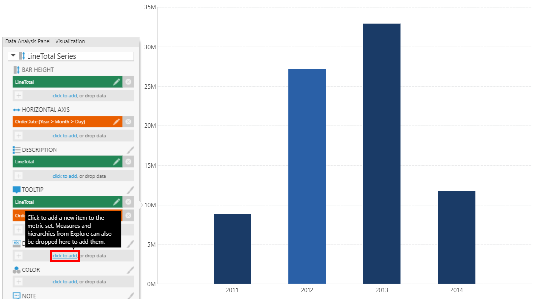
There are several ways to assign data to visualization options for the current visualization.- Drag from the Explore window: drag a measure or hierarchy (or one of its levels) from the Explore window and drop it under an option in the Visualization tab (similar to adding elements to the metric set), or drop it onto one of the corresponding labeled areas over the visualization.
- Drag within the Visualization tab: drag a measure or hierarchy already selected elsewhere in the Visualization tab and drop it where you want to add it. Note that if you press the Shift key while you drag within the Visualization tab, this will actually move the measure/hierarchy from one option to another.
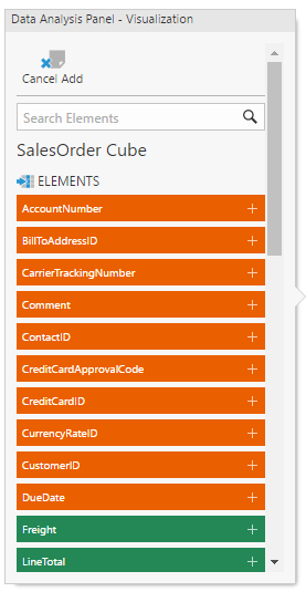
- Click to add: use the click to add link in the Visualization’s drop region and select the measure or hierarchy you want from a list.
Note: You can click any green or orange tile in the Data Analysis Panel to configure settings including number formatting. These are metric set settings that take effect everywhere the metric set is reused.
Editing Dashboards and Other Views
When you add an existing metric set to a dashboard or other view, for example by dragging it from the Explore window onto the canvas, a new data visualization is created based on the metric set’s default visualization. In the figure below, the newly added bar chart displays data point labels just like the metric set’s default visualization.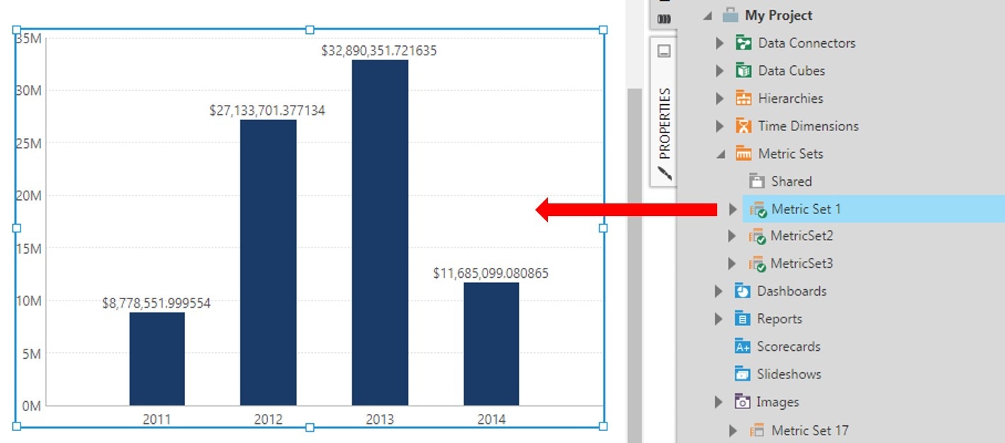
Data Analysis Panel
The Data Analysis Panel is open by default when adding a new data visualization instance, but will close if you click away. To open the Data Analysis Panel, use the context menu, or select the visualization on the canvas and click Data Analysis Panel in the toolbar.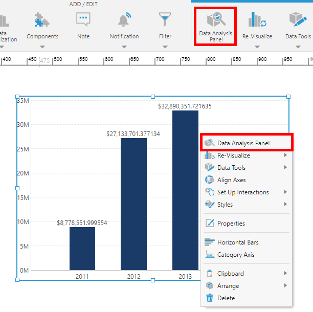
Data Visualization Drop Zones
An easy way to configure the Visualization tab is to drag a measure, hierarchy, or hierarchy level from the Explore window and drop it onto a data visualization drop zone. These labeled overlays that appear over a visualization correspond directly to the visualization settings, allowing you to choose how to visualize the data rather than allowing this to be assigned for you. These drop zones appear when dragging additional data after some initial data was already added - for example, a LineTotal measure has already been added to the table in the figure below.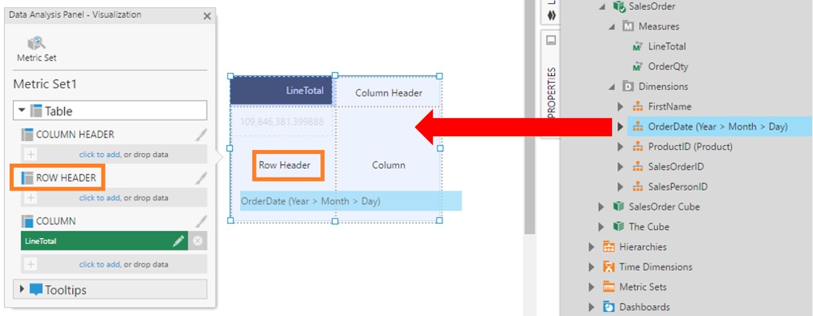
Update the Default Visualization
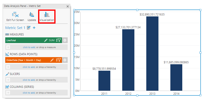
If you added a metric set from the Metric Sets folder to your view, once you’ve customized its visualization, you can apply its settings back to the metric set’s default visualization by clicking the Update button in the Data Analysis Panel. In newer versions, switch to the Visualization tab in the Data Analysis Panel first to find this option.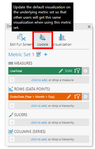
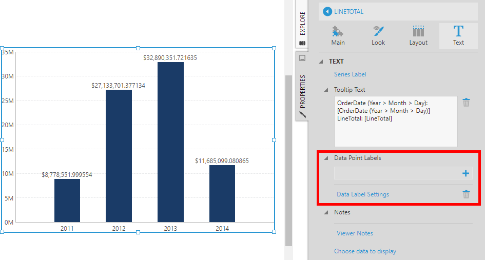
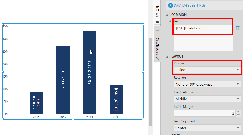
Properties
You can use the Properties window or the Properties pop-up for a data visualization to customize its settings, including colors, fonts, or further customizing how the visualization displays data you’ve assigned in the Data Analysis Panel. For example, you can customize how the colors of the data points should change according to the data. For text properties such as data point label text and tooltip text, you can use the Properties window to customize how the data is formatted into text. As an example, consider a bar chart that does not have any measures assigned to its Data Point Label visualization option in the Data Analysis Panel. Go to the Properties window for the chart series, click the Text tab, and you’ll see that the Data Point Labels property is empty.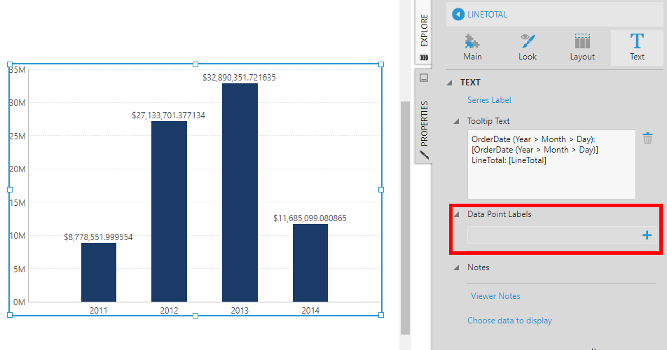
Note: Click the paintbrush icon next to a heading like Data Point Label to open the Properties window directly to the related settings.
- Video: Configuring Metric Sets
- Visualization Tab Examples
- Other Metric Set Tools
- Design Overview
- Using Chart Properties
- Apply Colors to Data Points or Series Using Color Rules
- Formatting Text