Note: To edit the number or date and time format for this visual, see Configure Number Formatting for Visuals and Configure Date and Time Formatting for Visuals.
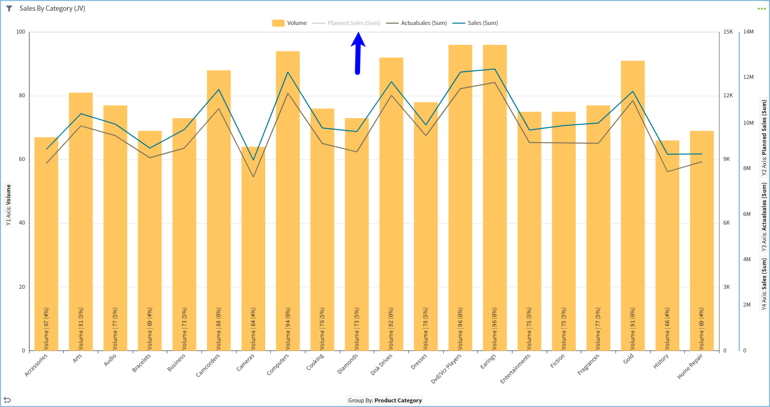
Planned Sales (Sum) metric is not shown on the chart and its name is grayed out in the legend. Adjust metric label visibility, values displayed, and positioning as needed.
Configure Settings for a Specific Combo Chart
Change the settings for a specific combo chart- Edit the combo chart you want to modify. See Edit Visuals.
- If you are editing the visual in a dashboard, select Settings from the chart drop-down menu. The sidebar menu for the visual appears.
- Select
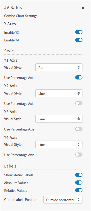
 on the sidebar menu. The Combo Chart Settings sidebar for the visual appears.
- Alter settings as needed:
| Setting | Description |
|---|---|
| Enable Y3 | Use this switch to enable or disable the third dependent variable (on the Y3 axis) on the combo chart. When disabled, the Y3 variable is not plotted. |
| Enable Y4 | Use this switch to enable or disable the fourth dependent variable (on the Y4 axis) on the combo chart. When disabled, the Y4 variable is not plotted. |
| Y1 Axis Visual Style | Use the drop-down list to select a visual style for the Y1 axis variable. Select Bar:, Line:, or Cumulative Line:. Enable Use Percentage Axis: to display as a percentage. |
| Y2 Axis Visual Style | Use the drop-down list to select a visual style for the Y2 axis variable. Select Bar:, Line:, or Cumulative Line:. Enable Use Percentage Axis: to display as a percentage. |
| Y3 Axis Visual Style | Use the drop-down list to select a visual style for the Y3 axis variable. Select Bar:, Line:, or Cumulative Line:. Enable Use Percentage Axis: to display as a percentage. |
| Y4 Axis Visual Style | Use the drop-down list to select a visual style for the Y4 axis variable. Select Bar:, Line:, or Cumulative Line:. Enable Use Percentage Axis: to display as a percentage. |
| Show Metric Labels | Enable to display labels for metric values. |
| Absolute Values | Enable to display the data in absolute values. |
| Relative Values | Enable to display the data in relative values. |
| Group Labels Position | Select a position option for the metric labels:Outside horizontal:, Outside diagonal:, or Outside vertical:. |
 to save the dashboard and the visual with its updated settings.
Configure Colors for a Specific Combo Chart
Specify the color settings for a specific combo chart using the Color sidebar- Edit the visual you want to modify. See Edit Visuals.
- If you are editing the visual in a dashboard, select Settings from the visual drop-down menu. The sidebar menu for the visual appears. If you are editing the visual from the Visual Gallery, the sidebar appears to the right of the visual.
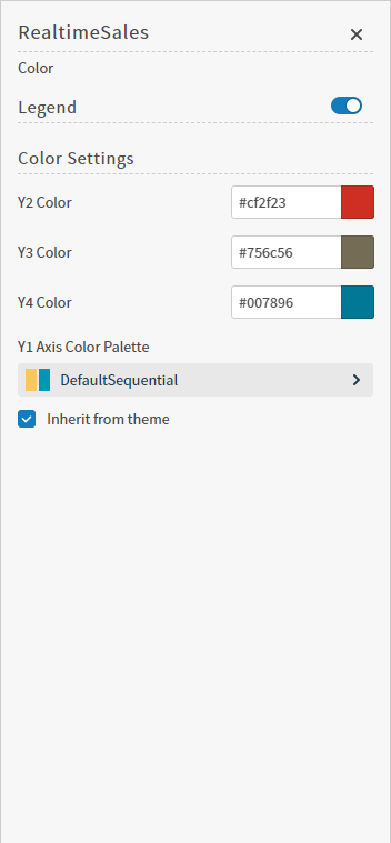
 on the sidebar menu. The Color sidebar for the visual appears.
- Configure the color settings as described below. As you change the color settings, the legend at the top of the Color sidebar shows how the legend will appear on the visual. Supported color specifications are described in Specify Colors.
| Setting | Description |
|---|---|
| Legend | Enable or disable to display a dynamic legend in this visual. Dynamic legends allow you to temporarily add or remove data shown in the visual.
If available, enable or disable a static legend for this visual. |
| Color Settings | Select colors for the Y2, Y3, and Y4 dependent variables plotted on the combo chart. |
| Y1 Axis Color Palette | Select the color palette for the Y1 axis for this specific combo chart. |
| Inherit from theme | Select this checkbox to use the color palette specified by the theme. |
- Select to save the dashboard and the visual with its updated settings.