- Plain : Based on 1 metric and 1 attribute
- Clustered : Based on 1 metric and 2 attributes
- Stacked : Based on 1 metric and 2 attributes
- 100% Stacked : Based on 1 metric and 2 attributes
- Configure Settings for a Specific Bar Chart
- Configure Colors for a Specific Bar Chart
- Understand Visual Color Condition Thresholds
Configure Settings for a Specific Bar Chart
Change the settings for a specific bar chart- Edit the bar chart you want to modify. See Edit Visuals.
- If you are editing the visual in a dashboard, select Settings from the chart drop-down menu. The sidebar menu for the visual appears.
- Select the settings icon (
 ) on the sidebar menu. The Bar Chart Settings sidebar for the visual appears.
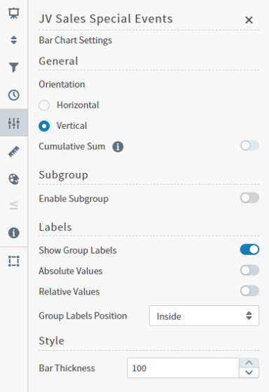
- Alter the settings as needed:
| Setting | Description |
|---|---|
| Orientation | Select Horizontal or Vertical orientation for the bars. |
| Cumulative Sum | When enabled, Symphonyupdates the visual to add the previous value to the next value, and both the original and cumulative value for selected items are displayed as a tool tip. In Bar visuals, this feature is only available when data is grouped by a Time field, and when the Enable Subgroup setting is disabled. |
| Subgroup | Slide on (to the right) the Enable Subgroup slider to enable a subgroup style. After enabling a subgroup style, select the style for the chart:Clustered Bar Chart, Stacked Bar Chart, or 100% Stacked Bar Chart. If Subgroups are enabled, you can define the visibility and position of their labels. |
| Show Group Labels | Enable to display labels for group values. |
| Absolute Values | Enable to display the data in absolute values. |
| Relative Values | Enable to display the data in relative values. |
| Group Labels Position or Subgroup Labels Position | Select a position option for the group or subgroup labels: Outside horizontal, Outside diagonal, or Outside vertical. |
| Style | Specify the bar thickness for the chart. |
- Select the save icon (
 ) to save the dashboard and the visual with its updated settings.
Configure Colors for a Specific Bar Chart
Specify the color settings for a specific bar chart using the Color sidebar- Edit the visual you want to modify. See Edit Visuals.
- If you are editing the visual in a dashboard, select Settings from the visual drop-down menu. The sidebar menu for the visual appears. If you are editing the visual from the Visual Gallery, the sidebar appears to the right of the visual.
 on the sidebar menu. The Color sidebar for the visual appears.
- Configure the color settings as described below. As you change the color settings, the legend at the top of the Color sidebar shows how the legend will appear on the visual. Supported color specifications are described in Specify Colors.
| Setting | Description |
|---|---|
| Legend | Enable or disable to display a dynamic legend in this visual. Dynamic legends allow you to temporarily add or remove data shown in the visual.
|
| Color Metric | Select the metric that affects the segment color in the visual. |
| <type> Color Palette | If Inherit from Theme is selected, the color palette is determined by the theme selected for the SymphonyUI. To override the palette selected by the theme, clear the Inherit from Theme checkbox and select a different color palette. |
| Color Mode | Select Distinct Colors or Gradient to identify the way colors are used on the screen. Either specific distinct colors will be used or a gradient of colors will be used. |
| Threshold Mode | If you selected the Gradient color mode, this setting cannot be changed. If you selected the Distinct Colors color mode, select either Auto or Manual from the drop-down list.Auto will automatically assign thresholds and colors for the visual. Manual enables you to change the thresholds and colors used on the visual. |
| Number of colors | Specify the number of colors to use for the visual. |
| Color Rules | Color rules allow you to change the colors for each color used for the visual. In addition, if you specified a Manual threshold mode, you can select the thresholds used for color settings in the visual. |
- Select to save the dashboard and the visual with its updated settings.
Understand Visual Color Condition Thresholds
You can set threshold color conditions for metric-based visuals. At least two color settings are required. In addition, thresholds are specified between each color setting. (So three color settings require two threshold settings; four color settings require three threshold settings, etc.)- The color for Color 1 is used when the value of the color metric is less than the first threshold value.
- The color for Color 2 is used when the value of the color metric falls between the first and second threshold values.
- If only three colors are used for the visual, the color for Color 3 is used when the value of the color metric is greater than or equal to the second threshold value.