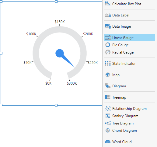
Elements of a Gauge
The figure below shows the main elements of a gauge visualization.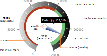
Types of Gauges
Linear Gauge
A linear gauge is characterized by a scale drawn as a straight line with either a horizontal or vertical orientation.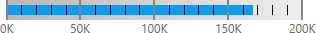
Bullet Graph
A bullet graph is a variation of a linear gauge that follows a particular design meant to emphasize readability and efficient use of space while allowing for meaningful context around the main value. You can use a series of bullet graphs in a relatively compact space to visualize and evaluate a number of key metrics.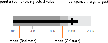
Note: If you have a metric set with multiple rows of data that can each be visualized as a bullet graph, you can use a table visualization’s bullet graph column type.
Radial Gauge
A radial gauge has a pivot point around which its pointers rotate, plus a circular scale.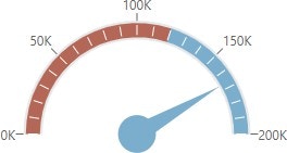
Pie Gauge
A pie gauge is a variation on a radial gauge that displays a metric as a percentage of the length of a circular scale, like a pie or donut chart with a single slice.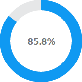
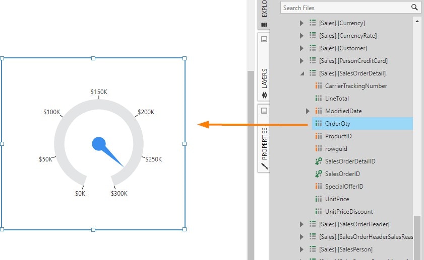
Adding a Gauge
The following is a brief walkthrough that shows you how to add a gauge to your dashboard. First, create a new dashboard from the main menu and use the Blank template. Go to the toolbar, click Data Visualization, scroll to the right, and click Radial Gauge.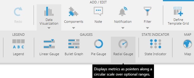
Scale
You can access the properties of a gauge scale from the Main tab in the Properties window.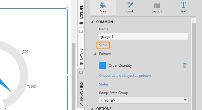
Start and Sweep Angle
By default, the scale of a radial gauge forms a nearly 360-degree circle. You can change the start and sweep angles of the gauge’s scale to have the gauge display as an arc (i.e., a partial circle).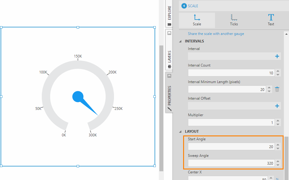
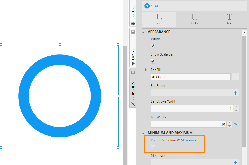
Minimum and Maximum
The scale’s minimum and maximum values are determined automatically based on the gauge’s underlying data. However, you can override this by setting the gauge scale’s Minimum and/or Maximum properties manually.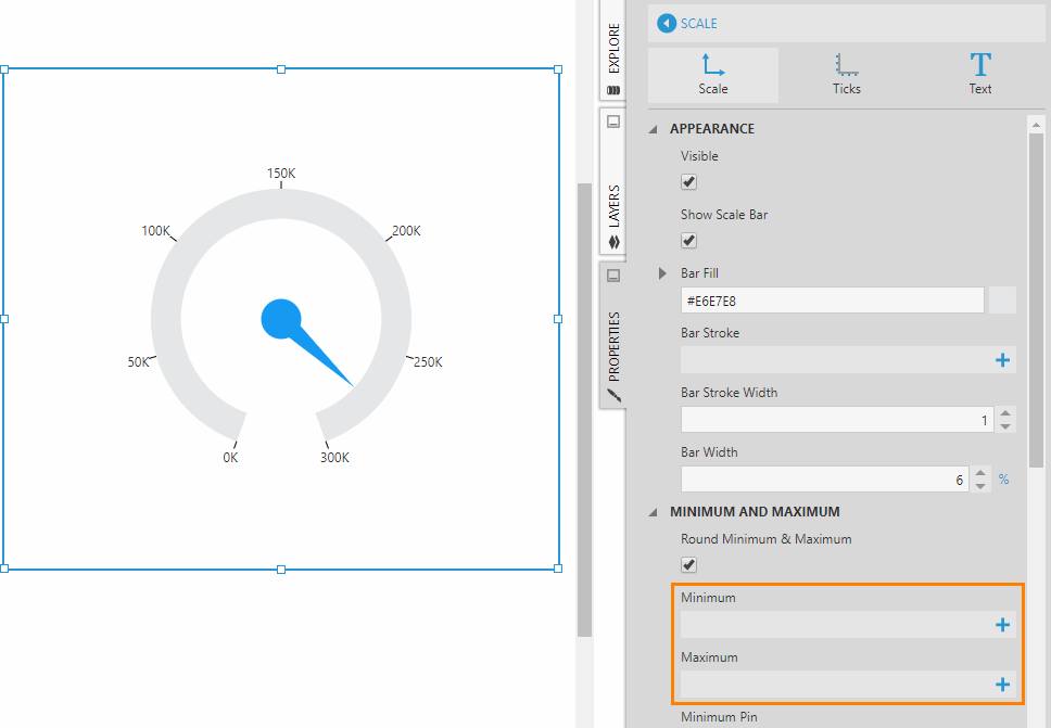
- Set up states which are displayed as ranges on the gauge
- Add a second measure which will be displayed as a second pointer (e.g., a target)
- Set the Maximum property manually
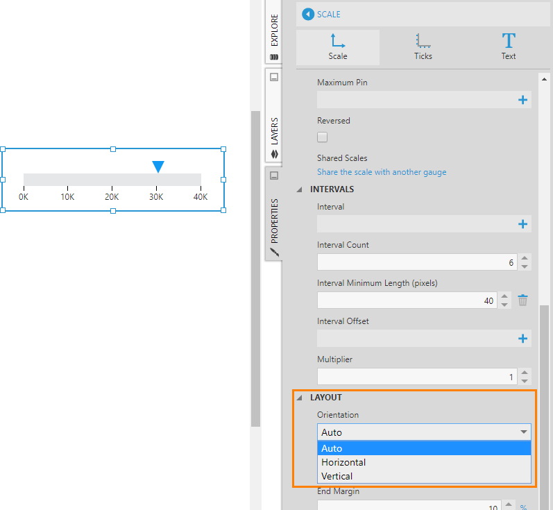
Orientation
As shown in the walkthrough, use the gauge scale’s Orientation property to orient a linear gauge horizontally or vertically. By default, this property is set to Auto , which means the orientation is adjusted automatically based on the width and height of the gauge.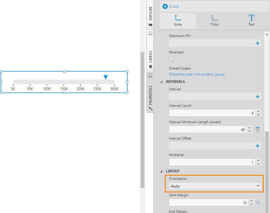
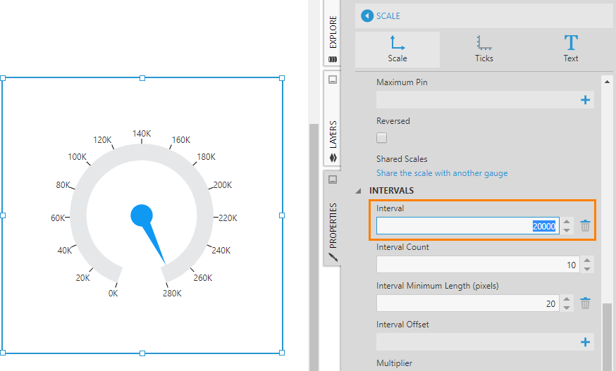
Interval and Interval Count
The Interval and Interval Count properties can be set on a scale itself, or on its major tick marks, minor tick marks, or labels.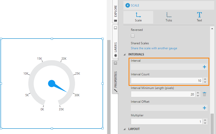
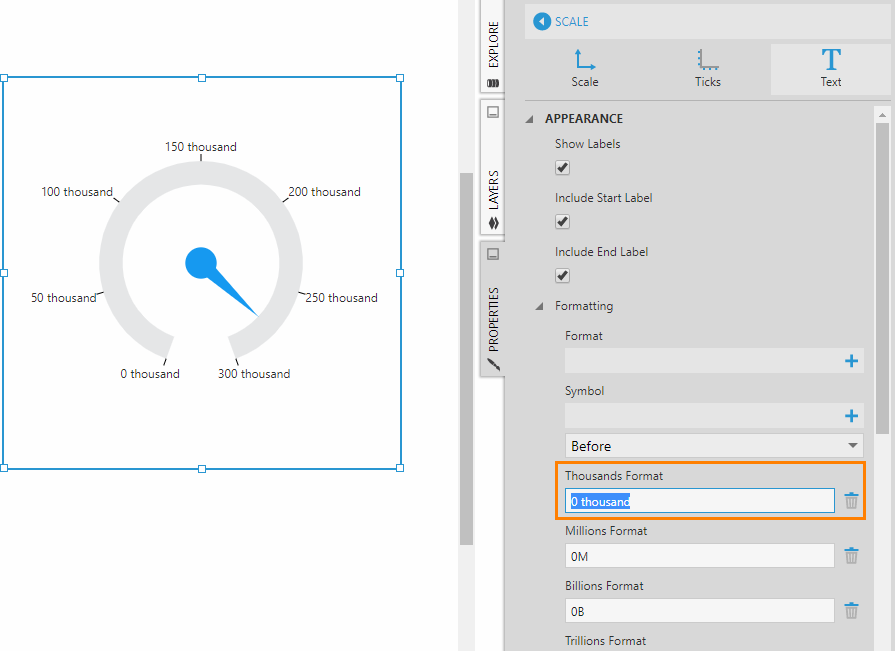
Label Style
To customize gauge labels, go to the Properties window for the scale series, click the Text tab.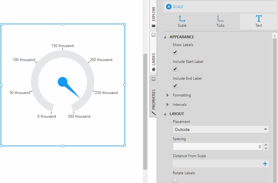
Alignment
By default, a radial gauge is centered within its rectangular bounds when its width and height are not the same. You can change this by going to the Layout properties for the gauge and using the Horizontal Alignment and Vertical Alignment properties to align it as needed.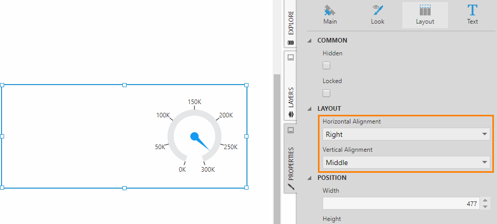
Pointers
A gauge has one or more pointers which correspond to the measures from a metric set. A second pointer is often used in gauges to represent a target measure or contextual metric value. Each pointer can be independently customized in terms of appearance and layout.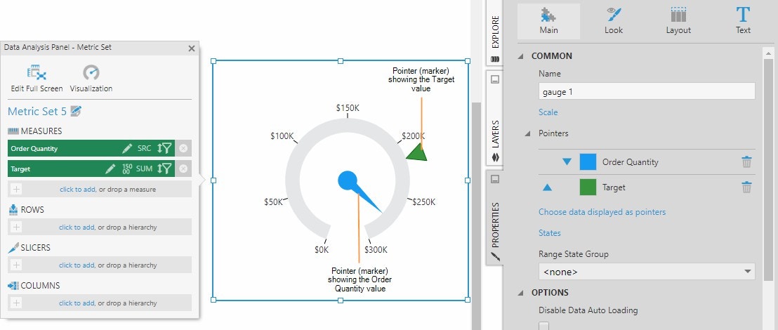
Pointer Type
The Pointer Type property has three options: Bar , Marker , and Needle. A radial gauge can use any of these pointer types but a linear gauge only supports Bar and Marker.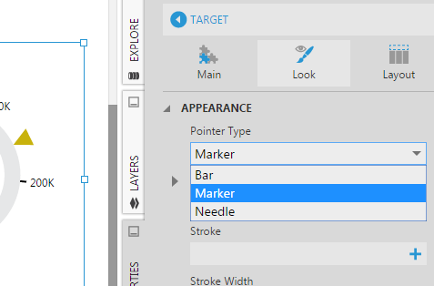
Note: For a bullet graph, the pointer type is set to Bar for the primary (actual) measure, and the pointer type is set to Marker for the comparative measure.
Marker Shape
If your pointer type is Marker , use the Marker Shape property to choose between a number of available shapes.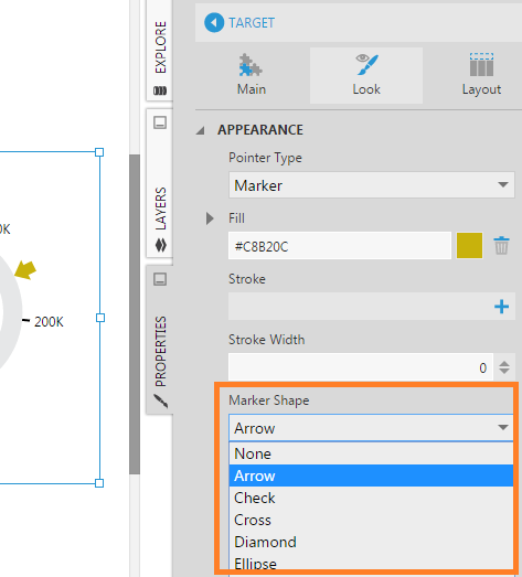
Note: For a bullet graph, the comparative pointer’s marker shape is set to Rectangle. The fill color for the marker and the marker width and height can be adjusted accordingly.
Placement
Go to the Layout section of a pointer’s properties to find the Placement property. Use this property to control whether the pointer (e.g., marker) should be placed on the inside or outside of the scale, or placed in the center of the scale.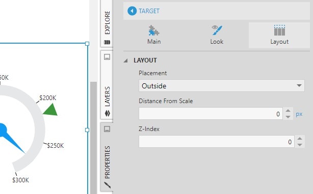
Ranges
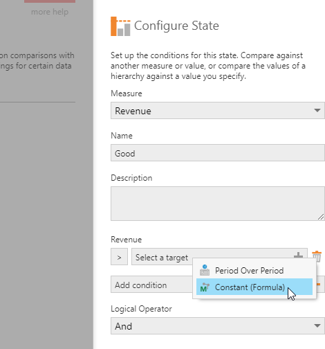
Gauge ranges display states from your metric set’s state group. Showing ranges on a gauge helps users to quickly identify the condition of the measure being monitored.Set Up States
To set up states for a gauge on a dashboard or other view, select the gauge on the canvas, go to the toolbar, click Data Tools, and then click Set Up States. (For a full screen metric set, click Set Up States in the toolbar.)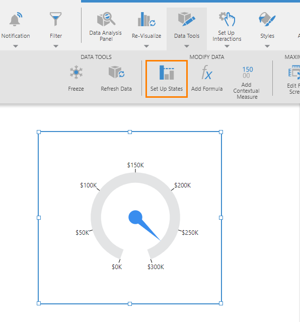
Range State Group
Next, go to the properties for the gauge. On the Main tab, set the Range State Group property to State Group 1, which is the state group that was just created. Ranges are automatically added to the gauge with default colors.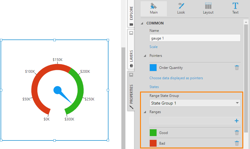
Start and End Width
In the Properties for the gauge, on the Main tab, you’ll see a list of ranges corresponding to the states (e.g., Good and Bad). Click on a range to edit its appearance. For example, change the fill color, Start Width, and End Width of the two ranges to achieve the look shown in the figure below.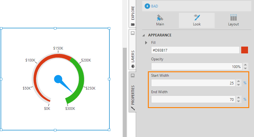
Note: These and many other properties of a gauge can be expressed using absolute pixel units (e.g., 15px) or as a percentage (e.g., 50%) relative to another size such as the width of the gauge scale.