This applies to: Managed Dashboards, Managed Reports This article gives specific examples of how to configure the visualization tab of the Data Analysis Panel for various types of data visualizations. The visualization tab helps you assign data elements from the underlying metric set to parts of the data visualization. Using the Data Analysis Panel and simple drag-and-drop operations, you can display data in the form of labels, headers, tooltips, colors, etc. See Setting Up the Visualizationto learn more about the visualization tab. Related video: Configuring Metric Sets.Documentation Index
Fetch the complete documentation index at: https://insightsoftware-preview.mintlify.app/llms.txt
Use this file to discover all available pages before exploring further.
Chart Visualizations
Grouping Series in a Bar Chart
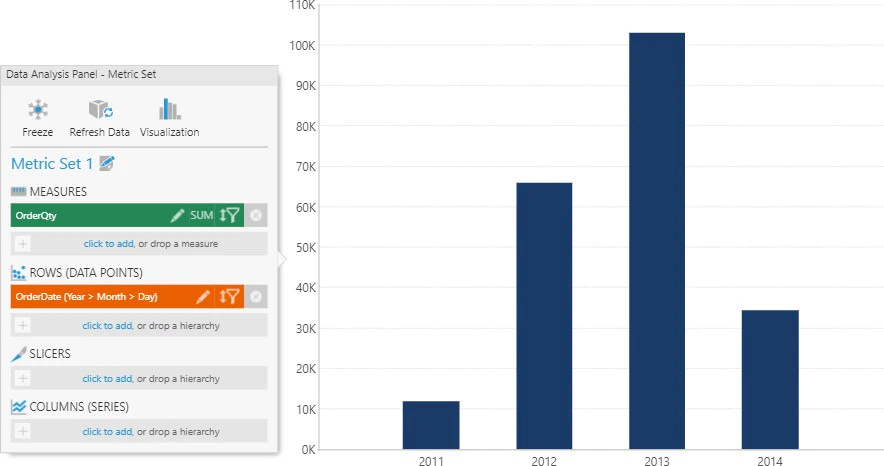
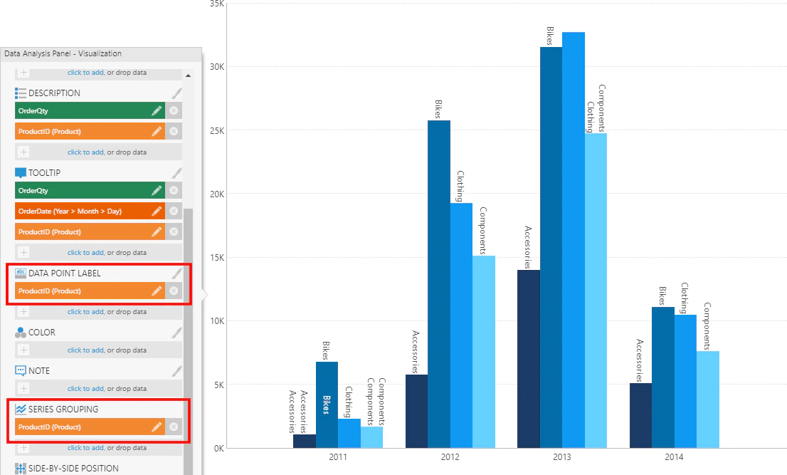
The Series Grouping option of a series allows you determine whether a data point series is grouped into multiple series based on a hierarchy’s values. As an example, consider a metric set with the following data selected and visualized as a bar chart:- Measures : OrderQty
- Rows: OrderDate hierarchy
Axis Labels
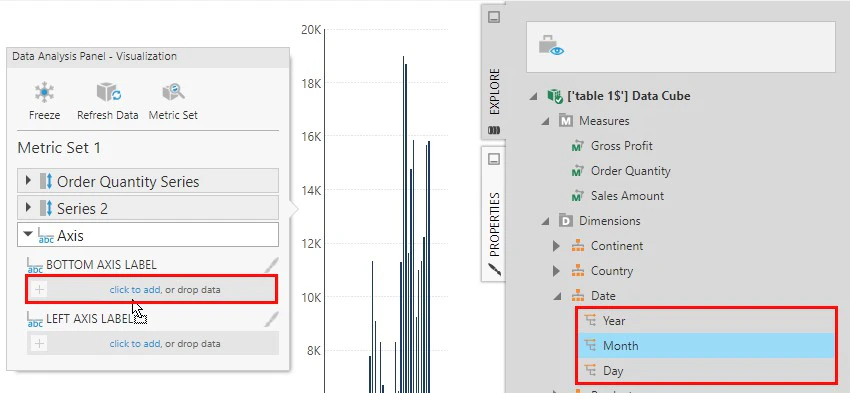
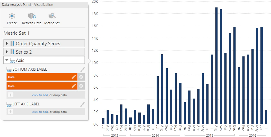
Axis labels can be used to display labels from upper levels of a hierarchy (e.g., Month grouping labels under Day labels) by dragging a hierarchy level from the Explore window, or to display measure values by dragging a measure. For example, consider the chart below showing typical axis labels displayed for a time dimension hierarchy. They combine the month names with the year repeated in consecutive labels.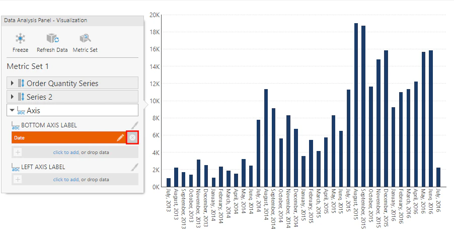
Color
Add data under Color to apply different colors to data points or series based on their values. Colors are applied according to color rules, which you can configure from the Properties window. See Apply Colors to Data Points or Series Using Color.Table Visualization
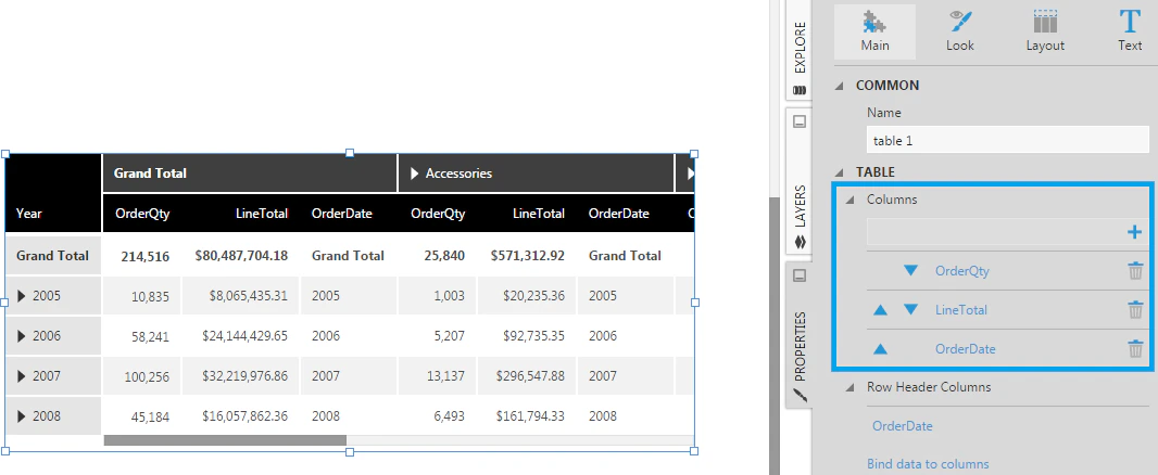
Consider the metric set with data selected as follows:- Measures : OrderQty , LineTotal
- Rows : OrderDate hierarchy
- Columns: Product hierarchy
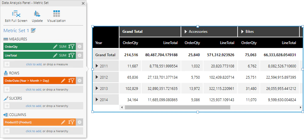
- Column Header - Displayed as a row of column headers above the table’s columns.
- Row Header - Displayed as a column of row headers to the left of the table’s columns. Row headers are a special kind of column designed to visually group data appearing on the right, where values are displayed once for consecutive rows instead of repeated. There may also be triangular expander buttons you can click to expand or collapse data to switch between summaries and details.
- Column- Displayed as regular (or ‘flat’) table columns. These columns are repeated for each column hierarchy value (e.g., each Product hierarchy value).
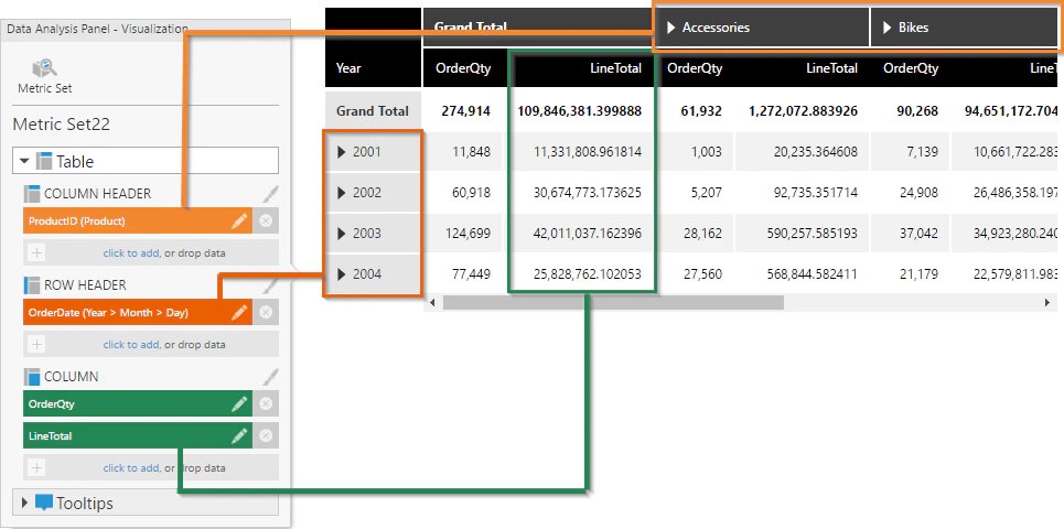
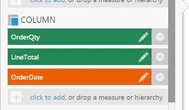
sNote: Similar to axis labels, drag a hierarchy level from the Explore window under Column if you want to display a specific level.
Note: Click Choose data to display in the Properties window to open the Data Analysis Panel and go directly to the Visualization tab.
- Video: Configuring Metric Sets
- Handling Missing Data
- Slicers Versus Columns and Rows
- Using Chart Properties
- Using a Table Visualization
- Set Up a Hover Over Interaction
- Apply Colors to Data Points or Series Using Color Rules