This applies to: Managed Dashboards, Managed Reports This topic provides links to topics related to selecting and grouping data.Documentation Index
Fetch the complete documentation index at: https://insightsoftware-preview.mintlify.app/llms.txt
Use this file to discover all available pages before exploring further.
New Metric Set
- To create a metric set in the full-screen editor, select Business in the main menu, then Metric Set.
- Start by choosing your first data source. a wide variety of security and permissions
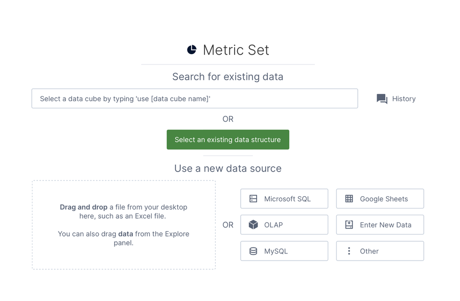
- Drag it onto the canvas, or choose Use an existing data structure to locate it in Symphony.
- A table visualization now displays whatever data you chose with the Data Analysis Panel to the left.
Note: Create and edit metric sets directly on a dashboard or other view by dragging data onto its canvas, then using the same Data Analysis Panel.
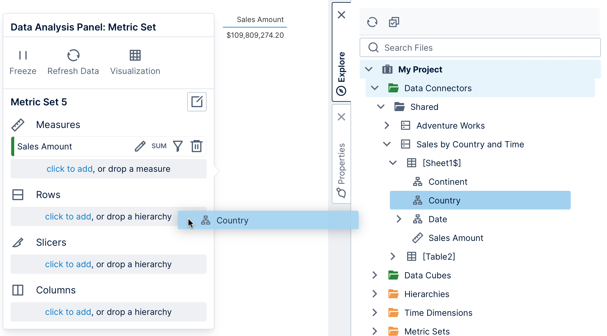
Adding More Data
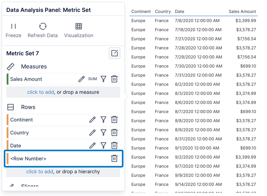
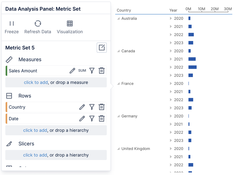
The Data Analysis Panel is central to choosing and analyzing data. Regardless of which visualization you use, you can group and filter your data by placing it under one of these same four options:- Measures : numeric values that can be grouped and filtered
- Rows : group by this data into a row for each value
- Slicers : filter the data by the selected values
- Columns: group by this data into a column for each value
Note: In the Explore window, different icons indicate whether data is has been categorized as a measure (numeric data) or a hierarchy (usually non-numeric data). If you are working with data from a data connector directly, you can use numeric data as either a measure or hierarchy regardless, or you can right-click and choose Change Category: to switch between them. (Database primary keys with key icons are typically numeric but used as hierarchies.)
Note: You can drag data from another table or data source in the Explore window and it will be automatically joined. This uses database relationships for tables from the same database, or relationships for different data sources.