> ## Documentation Index
> Fetch the complete documentation index at: https://insightsoftware-preview.mintlify.site/llms.txt
> Use this file to discover all available pages before exploring further.

# Line Trend Attribute Value Charts

export const InlineImage = ({src, href, alt = "", size = "medium", customSize, position = "left", children}) => {
  const sizeClasses = {
    small: "w-6 h-6",
    medium: "w-8 h-8",
    large: "w-12 h-12",
    xlarge: "w-16 h-16"
  };
  const ImageComponent = () => <img src={src} alt={alt} className={customSize ? '' : sizeClasses[size]} style={{
    verticalAlign: 'baseline',
    display: 'inline-block',
    margin: '0',
    padding: '0',
    border: 'none',
    maxHeight: '1em',
    ...customSize ? {
      width: customSize,
      height: customSize
    } : {
      width: '1em',
      height: '1em'
    }
  }} />;
  const imageElement = href ? <a href={href} className="inline-block border-b-0 no-underline">
            <ImageComponent />
        </a> : <ImageComponent />;
  return <>
            {position === "left" && imageElement}
            {position === "left" && " "}
            {children}
            {position === "right" && " "}
            {position === "right" && imageElement}
        </>;
};

Attribute value line charts are based on one metric, one attribute and one time attribute. Attribute value line charts are supported by all Composer [data connectors](/logi-symphony/composer/v24/navigate/data-connector-reference) except Cloudera Search. They are supported by Composer Apache Solr connectors for version 5.2 or later.

This topic describes:

* [Configure Settings for a Specific Attribute Value Line Chart](#configure-settings-for-a-specific-attribute-value-line-chart)
* [Configure Colors for a Specific Attribute Value Line Chart](#configure-colors-for-a-specific-attribute-value-line-chart)

For information on setting even time intervals, see Even Time Intervals.

## Configure Settings for a Specific Attribute Value Line Chart

<b>Change the settings for a specific attribute value line chart</b>

1. Edit the attribute value line chart you want to modify. See Edit Visuals.

2. If you are editing the visual in a dashboard, select <b>Settings</b> from the visual drop-down menu. The sidebar menu for the visual appears.

If you are editing the visual from the Visual Gallery, the sidebar appears to the right of the visual.

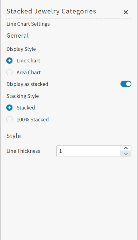
3. Select <InlineImage src="/images/image_26.png" alt="" href="https://logi-composer-v24.insightsoftware.com/hc/article_attachments/38075498463757" /> on the sidebar menu. The Line Chart Settings sidebar for the visual appears.

<Frame>
  <img src="https://mintcdn.com/insightsoftware-preview/StJJCeTmWK0u1SbF/images/line-settings.png?fit=max&auto=format&n=StJJCeTmWK0u1SbF&q=85&s=bbe52fc3ac6e9da3eab4137864cb8270" alt="" width="441" height="765" data-path="images/line-settings.png" />
</Frame>

4. Alter the settings as needed:

<table cellspacing="0" class="TableStyle-GENERIC-TABLESTYLE"><thead><tr class="TableStyle-GENERIC-TABLESTYLE-Head-Header1"><th class="TableStyle-GENERIC-TABLESTYLE-HeadE-Column1-Header1">Setting</th><th class="TableStyle-GENERIC-TABLESTYLE-HeadD-Column1-Header1">Description</th></tr></thead><tbody><tr class="TableStyle-GENERIC-TABLESTYLE-Body-Body1"><td class="TableStyle-GENERIC-TABLESTYLE-BodyE-Column1-Body1">Display Style</td><td class="TableStyle-GENERIC-TABLESTYLE-BodyD-Column1-Body1"><p>Select <b>Line Chart</b> or <b>Area Chart</b> to indicate the type of chart you want to see.<b>Line Chart</b> is selected by default. </p><p>The <b>Area Chart</b> setting turns on the fill option for the line chart (fills the visual with appropriate colors between the lines). </p><p>The <b>Line Chart</b> setting turns off the fill option (so only lines appear).</p></td></tr><tr class="TableStyle-GENERIC-TABLESTYLE-Body-Body2"><td class="TableStyle-GENERIC-TABLESTYLE-BodyE-Column1-Body2">Display as stacked</td><td class="TableStyle-GENERIC-TABLESTYLE-BodyD-Column1-Body2">Slide this switch on (to the right) to display the visual as a stacked area chart. When turned on, the Stacking Style options become available.</td></tr><tr class="TableStyle-GENERIC-TABLESTYLE-Body-Body1"><td class="TableStyle-GENERIC-TABLESTYLE-BodyE-Column1-Body1">Stacking Style</td><td class="TableStyle-GENERIC-TABLESTYLE-BodyD-Column1-Body1"><p>Select one of the stacking styles<b>Stacked</b> or <b>100% Stacked</b>. These options are only available if the <b>Display as stacked</b> switch is on. </p><ul><li><p>The <b>Stacked</b> setting is the default and displays the plotted lines in a stacked format. Stacked charts are best used to show how individual values in the data relate to all of the other values for the same data. </p></li><li><p>The <b>100% Stacked</b> option displays the plotted lines in a stacked format but as they relate to a cumulative whole. The y-axis cumulative total is always represented as 100% in a 100% stacked format and all individual values are presented as percentages of the whole.</p></li></ul></td></tr><tr class="TableStyle-GENERIC-TABLESTYLE-Body-Body2"><td class="TableStyle-GENERIC-TABLESTYLE-BodyB-Column1-Body2">Line Thickness</td><td class="TableStyle-GENERIC-TABLESTYLE-BodyA-Column1-Body2">Increase or decrease the thickness of the lines in the visual using the up and down arrows in this box.</td></tr></tbody></table>
5\. Optionally, edit the number or date and time format for this visual. See Configure Number Formatting for Visuals and Configure Date and Time Formatting for Visuals.

6. Select <InlineImage src="/images/image_22.png" alt="" href="https://logi-composer-v24.insightsoftware.com/hc/article_attachments/38075494009229" /> to save the dashboard and the visual with its updated settings.

## Configure Colors for a Specific Attribute Value Line Chart

<b>Specify the color settings for a specific attribute value line chart using the Color sidebar</b>

1. Edit the visual you want to modify. See Edit Visuals.

2. If you are editing the visual in a dashboard, select <b>Settings</b> from the visual drop-down menu. The sidebar menu for the visual appears. If you are editing the visual from the Visual Gallery, the sidebar appears to the right of the visual.

Select <InlineImage src="/images/image_15.png" alt="" href="https://logi-composer-v24.insightsoftware.com/hc/article_attachments/3075498467213" customSize="24px" /> on the sidebar menu. The Color sidebar for the visual appears.

<Frame>
  <img src="https://mintcdn.com/insightsoftware-preview/StJJCeTmWK0u1SbF/images/color-simple1-new.png?fit=max&auto=format&n=StJJCeTmWK0u1SbF&q=85&s=c85970143502e71685f5a65744117f78" alt="" width="395" height="776" data-path="images/color-simple1-new.png" />
</Frame>

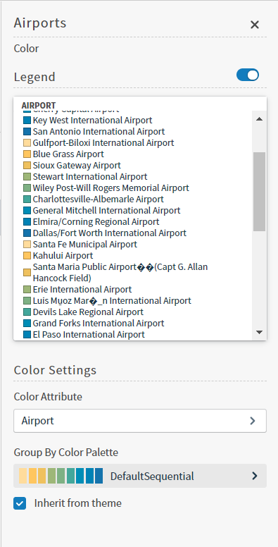
3. Configure the color settings as described below. As you change the color settings, the legend at the top of the Color sidebar shows how the legend will appear on the visual. Supported color specifications are described in Specify Colors.

<table cellspacing="0" class="TableStyle-GENERIC-TABLESTYLE"><thead><tr class="TableStyle-GENERIC-TABLESTYLE-Head-Header1"><th class="TableStyle-GENERIC-TABLESTYLE-HeadE-Column1-Header1">Setting</th><th class="TableStyle-GENERIC-TABLESTYLE-HeadD-Column1-Header1">Description</th></tr></thead><tbody><tr class="TableStyle-GENERIC-TABLESTYLE-Body-Body1"><td class="TableStyle-GENERIC-TABLESTYLE-BodyE-Column1-Body1">Legend</td><td class="TableStyle-GENERIC-TABLESTYLE-BodyD-Column1-Body1"><p>Enable or disable to display a dynamic legend in this visual. Dynamic legends allow you to temporarily add or remove data shown in the visual. </p><ul><li><p>For distinct color styles, select a data point in the legend to turn it off and on in the visual.</p></li><li><p>Use the color selector to manually assign colors for legend items.</p></li></ul><p>If available, enable or disable a static legend for this visual.</p></td></tr><tr class="TableStyle-GENERIC-TABLESTYLE-Body-Body2"><td class="TableStyle-GENERIC-TABLESTYLE-BodyE-Column1-Body2">Color Attribute</td><td class="TableStyle-GENERIC-TABLESTYLE-BodyD-Column1-Body2">Select the attribute that affects the segment color in the visual. </td></tr><tr class="TableStyle-GENERIC-TABLESTYLE-Body-Body1"><td class="TableStyle-GENERIC-TABLESTYLE-BodyB-Column1-Body1">Group By Color Palette</td><td class="TableStyle-GENERIC-TABLESTYLE-BodyA-Column1-Body1"><p>Select a color palette for this specific visual.</p><p> Select the <b>Inherit from theme</b> checkbox to use the color palette specified by the theme.</p></td></tr></tbody></table>
4\. Close the Color sidebar and the color settings are dynamically applied to the visual.

5. Select <InlineImage src="/images/image_22.png" alt="" href="https://logi-composer-v24.insightsoftware.com/hc/article_attachments/38075494009229" /> to save the dashboard and the visual with its updated settings.